Now I'm designing a new banner for my blog! I using Adobe CS 5 to do this.
In this tutorial, I will explain the tool I had used. And create a new image using the layer and the workspace tools.
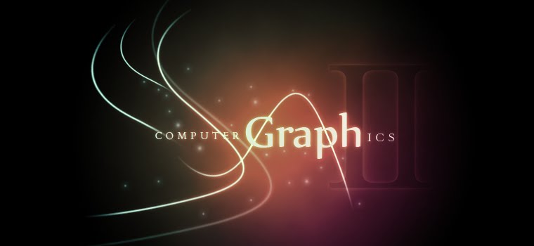
Let's see the results!
Here is the process of banner!!
First create a new document. I set the width and height to 760X350 with resolution 300.
This is a format of banner in Blogger .
After that, begin with a radial gradient, This one is pretty harsh and goes from a reddish brown color to black.
Duplicate the layer we just made, and set the one above blending mode to color dodge.
Color Dodge is probably the strongest of the lightening ones. As you can see the screenshot below, it produces a pretty full-on center.
We are going to create a sort of smoke haze. To do this, create a new layer, and make sure you have a white and black background and foreground colors. Then go to Filter > Render > Clouds. This will give you the same random cloud pattern as above.
Now set the opacity of the cloud's layer to Overlay and 30% transparency. Then go to filter > Sketch > Chrome and use default settings which are 4 and 7 for detail and smoothness respectively. When you are done, the result should look a lot smokier.
Once we got a background, now we are going to draw some line using the Pen Tool. For us, it is not difficult to draw a nice line using this tool. Because we learnt this tool at Adobe Illustrator before. So this will not a big problem for us.
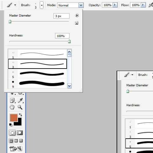
Once you get a nice curve line, create a new layer and click on the Paint Brush(B) and choose a very hard, very thin brush . and the thickness should be 3.
Note that you can have any color selected as your brush color.
Now switch back to the Pen Tool. You must switch tools in order to do this next bit.
Then right-click and select Stroke Path. Choose Brush and make sure there is a tick next to Simulate Pressure.
You should now have something like this. Thin and cool swishy thing.
Now we going to do some glows. Double click or right click on the layer to open the layer blending option.
This is my settings.
After that, you will have a cool glow line. So now repeat the same process a couple of time to make some squiggly lines. Re-order the layer of the line or re-transform it to get a nice composition. Remember copy the previous layer style and paste it on the other layers.
Here I've added some text in and applied the same layer style to the text layers.
Now we add some particles. To do this, open a new layer then select a tiny paint brush - size 3 between 5. and just paint some dots on. After that paste our Glow style on that layer too!!
At the final part, I create a new layer and using a radial gradient , draw a blue to white gradient and purple and etc on it. Then i set the layer to a blending mode of color and change the opacity to 50%.
You can add more extra layer and color to it using the radial gradient tool to get a nice color.
And remember to set each layer to blending mode of color and thin opacities so that they all fade together.


